What Users Are Saying About HERD Visualizer
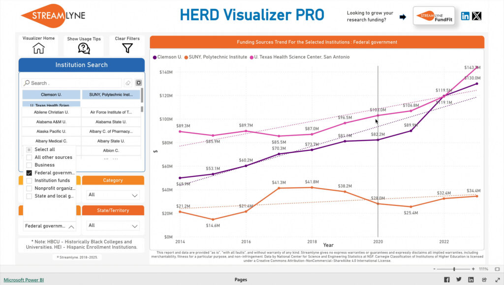
“Streamlyne’s HERD Visualizer Pro has been a game changer for us. In my role as Vice President for Research, I’m often tasked with drawing insights from the HERD dataset, at short notice. This innovative tool has made it remarkably easy to visualize and compare funding trends, which helps me and my team with data-informed decision-making, strategic planning, and even identifying growth opportunities. What I appreciate most is how intuitive and easy-to-use the visualizer is. What once took days of manual data wrangling can now be done in minutes. I no longer have to dig through dozens of spreadsheets or wait on custom reports. HERD Visualizer Pro gives me the answers I need, right when I need them.”

New Mexico State University (NMSU)
"If you want to explore HERD data in a meaningful and productive way, Streamlyne’s HERD Visualizer is an incredibly effective and user-friendly tool. It is powerful and intuitive, providing clear, actionable insights into R&D expenditures by institution. It also allows you to segment by funding source and graph out year-over-year trends. I especially appreciate the ability to filter by top performers and benchmark against peers, which informs our annual strategic planning. The HERD Visualizer is a must-have for any institution that prides itself on data-informed, strategic decision making."

Dean of the Graduate College
The University of Texas Rio Grande Valley


