Update February 2024: You now have access to two levels of the HERD Visualizer with the newest dataset (2022): The free and restricted Lite version and the full-featured PRO version. Both make use of the newest HERD dataset that is available and both are intuitive and interactive. And if you want even more custom data metrics, ask us for a demo of Streamlyne Analytics.
Here at Streamlyne, we are always seeking new and innovative ways of data application. This is evidenced through our popular offerings, such as our Streamlyne Research eRA software. And with everything we build, our developers push to find valuable ways of harnessing data. The insights gained through our powerful software solutions help RAs better manage their research administration ecosystem. And we thought it would be helpful to give you just a little sample of this with our free HERD Survey Visualizer, which you can make use of right on this website.
What is the HERD Survey?
For quick context, the Higher Education Research and Development (HERD) Survey provides information about research and development expenditures across U.S. universities and colleges. It is comprised of institutions that expended a minimum of $150,000 in designated R&D in the fiscal year indicated. The current survey format was introduced in 2010, though the initiative dates back to 1972.
What is Streamlyne’s HERD Survey Visualizer?
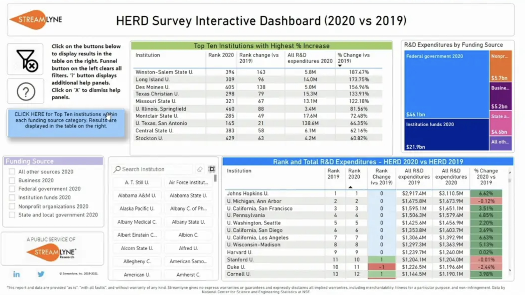
Instead of static results, our HERD Survey visualizer is an interactive tool. It lets you organize the survey data in any number of different ways, interactively, and in real time. This helps to create a deeper understanding of the survey results in a clean and intuitive format.
For example, you can see the Top 10 universities at a glance, as well as those with the highest percentage increase in R&D expenditures vs the previous year:
You can clear all filters when you are ready to start a fresh search:
Also, you can see the 10-year trend for any university:
Further, you can compare universities and see how they each measure:
And, if you ever want extra guidance, there are built-in help panels to explain what each feature accomplishes:
These types of visual data applications are the kinds of benefits our clients experience every day — all in one place.
Try the Visualizer for yourself
Now that you’ve seen the walkthroughs, it’s time to try the HERD visualizer for yourself. Head over to the HERD Funding Visualizer link and look up your own institution, or many others.
Some of these features may be available on the PRO version only. So want even more access to search and filter functions, sign up for the HERD Visualizer Pro subscription. Also, be sure to schedule a demo so we can show you how to take those insights further with Streamlyne Analytics. Imagine using HERD data plus your institutional data to create data insights, benchmark comparisons, and reports that are easy to use and understand. Wouldn’t that help take insights to the next level?
Why Streamlyne Research?

We look forward to hearing from you soon and sharing the many advantages of Streamlyne Research for your university.
REQUEST A DEMO